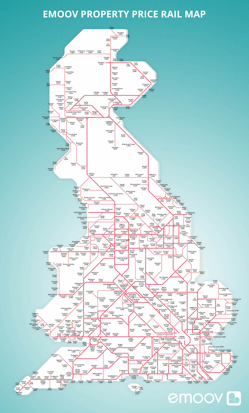
The map, by property company eMoov, reveals huge disparities between areas, with prices plummeting just by moving from Zone 1 to Zone 2. We all know that Zone 1 in London is an expensive place to live. But how Expensive The Map shows the average property price for somewhere near one of the capital’s 14 main rail terminals/train stations is just over £1 million. But, moving slightly further out to near Clapham Junction, that figure falls to £711,000. Further east, in Zones 2 and 3, Stratford’s average price is around half that – only £359,000. How much do you and I earn Well surely we can’t afford these expensive areas to live in?
Heading out slightly further down to somewhere like Bromley South in Zone 5, the price topples to a far more affordable £295,000. The station with the cheapest price shown on the map for London is Barking, where homes are an average of just £255,000. So, should we move to the Far East Should we all move to Barking Well that is what it looks like.
Interestingly, the map shows how this pattern is spread across the entire country, albeit on a cheaper scale. Russell Quirk, founder of eMoov, said: The latest trend for homeowners in London has been to forsake the capital’s inflated property market for the commuter belt surrounding it. “But when you look elsewhere in the country there are other examples of homeowners opting to live outside larger cities to save on the price of their property. “This property rail map allows you to visualise these.”
There you go, property priced in Central London are inflated 3 fold that of any part of the city and Barking sounds like a place to buy a home. What say, readers?
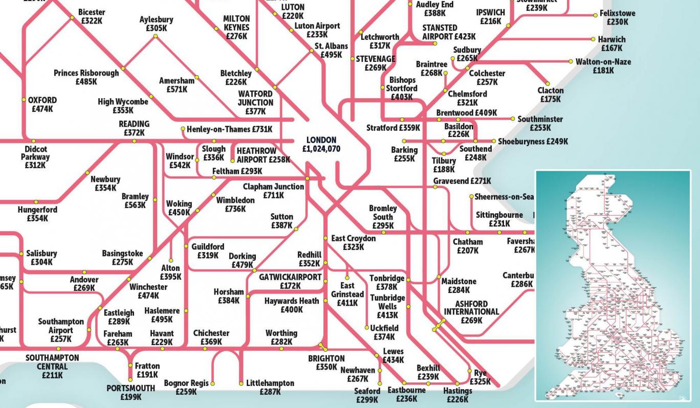
You can see the whole country’s Property value map in the image below. Click on the image below to see a bigger and much clearer picture of the property area you are interested in. You can also “Click Here” to see the larger version of the London Property value map.
